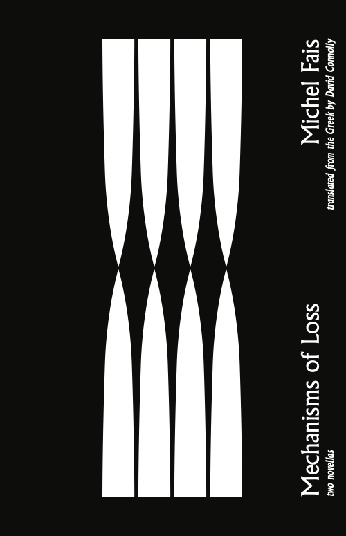
Cover Designs for Yale Press
1) This design takes the most liberties with the interpretation of the text. The centered shapes abstract from the idea of teeth, talons, or claws, grinding in hopeless tension, drawing from the domestic despair and neurotic spitballing present in the texts. Something beautiful emerges from the negative space and the collective form of the shapes, just like with the language. The type draws on Greek influence.
2) More neutral, the idea for this design is a chaotic scaffolding around an ordered architecture of thought. The scribbles relate to the handwritten text and to the personal touches of a journal.
3) This design with the staircase hints at the duality of possible reads for the disorienting text. The type selection is simple, allowing the zigzagging lines of the steps to dominate the visual language. The torn paper and the staples gesture at the intensely personal, autobiographical nature of the works, and also at a kind of frantic necessity to get words down on paper.
